Dreadnought Puzzles


File_000 (35).jpeg

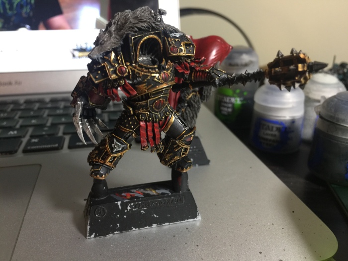
I don’t know how many of you have noticed, but Games Workshop just released more Space Marine miniatures, including a new dreadnought.

I bought one. Hard to believe I bought more Space Marine stuff, huh? Despite having the same reservations towards the Redemptor that I had towards the Primaris (they’re trouncing decades of established lore and imagery! It’s expensive! It looks horrendous! WAAAAH!) I’ve come to realize that it is indeed a wonderful miniature. Much more digital ink shall be spilled on these pages regarding my opinions of it (and the work I’ve done to make it look a little better, in my opinion). But first I’d like to bring to your attention an interesting building/hobby development that I’ve noticed in the kit.

In the first picture above you’ll note the left side of the Dreadnought’s chassis needs the exterior armor glued on. On the hobby mat next to it are the two pieces which make up the armor. See below for a closer look at their undersides:

File_001 (13).jpeg

Note the two tabs on each plate of armor. Note also the two tiny male and female nubs on the two bits. The larger tabs line up with the slots on the chassis, while the two nubs line up with each other in order to ensure the bits are aligned.

File_002 (11).jpeg

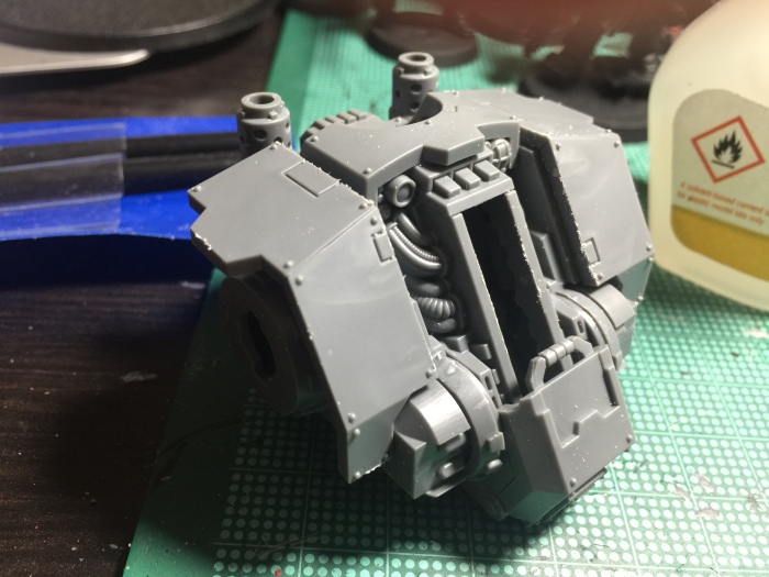
The end result is above – a perfectly aligned, perfectly placed couple of bits of armor. This design element is repeated all over the kit, with tabs and nubs placed in strategic locations to ensure everything goes together as it should.

Is this a new innovation? Are Games Workshop the first to implement it in their kits? Does it keep the Redemptor from looking like a pot-bellied Robocop reject? No on all counts. But Games Workshop have made a lot of strides in a lot of different areas over the past year or so, and this is just another one of the small quality-of-life improvements they have made that have contributed to their stellar past year.

The Warmaster Part 6 – Highlight of the Night

File_000 (31).jpeg

Spent most of the past couple of nights highlighting the gold and red on Horus, and am quite happy with the results. The red had Mephiston Red reapplied to the raised areas, then highlighted with a Mephiston Red/Evil Sunz Skarlet 50/50 mix, and then straight Evil Sunz Skarlet. The gold followed the Adeptus Custodes recipe, with a layer of Liberator Gold, followed by an edge highlight of Auric Armor gold and some tiny amounts of Runefang Steel (essentially anywhere that there was a sharp point).

The red turned out quite well, although some parts of the gold were so fine that it wasn’t overly obvious that they were highlighted in any way. Regardless, the gold is shiny and gleaming, which is what I wanted, so I’m happy with the way it turned out.

I also painted up the Luna Wolves emblems on his right knee and left shoulder (interesting that his left knee and right shoulder bear the Sons of Horus eyes – perhaps it was intentional that they were on opposite limbs?). These saw a basecoat of Celestra Grey followed by a slight Nuln Oil wash and highlights with Ulthuan Grey.

I forgot to mention in earlier parts that the metallic parts (cables, hydraulics on his armor, etc) were basecoated in Ironbreaker, washed with Nuln Oil, and then re-highlighted with Ironbreaker and Runefang Steel.

Next up: the Warmaster’s mug.

The Warmaster Part 5 – Red, Red Wine

File_000 (30)

The Warmaster got his first coats of red last night, mainly on his pteruges, the red Eyes of Horus on his armor, and of course his giant flowing cape. I decided after the above picture was taken that I would also paint the vambrace on his left arm and most of the Talon of Horus in red to balance out the colors a little bit, as he needed a little color variation in his limbs.

I followed the red with a wash of Agrax Earthshade, not only on on the red but also the gold parts of his armor. I was tempted to try using Reikland Fleshshade on the gold as I did with my Adeptus Custodes models, but after trying it out it just looked a little too reddish for my taste. The Agrax Earthshade kept the gold looking like gold. I applied the wash only to the thicker/larger gold highlights, as I saw little point in shading the smaller bits of gold since I’d eventually be re-applying the basecoat to it anyway to clean it up.

With the red added the mini is starting to take shape – time to start thinking about midtones and highlights!

The Warmaster Part 4 – Goooooold

File_000 (29)

With the black armor mostly done save for some fine edge highlighting that I’ll be saving until the very end, it was time to move on to the gold details. I considered using Balthasar Gold for the basecoat for this, but I wanted the gold to really gleam and when Balthasar Gold is washed with Agrax Earthshade it can give more of a copper or bronze look rather than the gleaming gold look I thought would be appropriate for the Warmaster. So I followed the recipe I used for my Adeptus Custodes models (I’ll have to share some pics of those models soon), and went with Retributor Armor for my basecoat.

It was time-consuming, to say the least, given the sheer amount of often tiny gold details on the model that needed to be picked out on gold. I tried to remind myself constantly to take my time, and remember that instead of a squad of 5-10 models I could focus my attention on a single model. I regularly washed and cleaned off my brush (a GW small artificer brush) to maintain that sharp tip that let me really get at those tiny details, especially the tiny gold filigree around the armor panels.

Next up I’ll be tackling the basecoats on the red pteruges, vambraces, and the eyes of Horus on his armor. Time to break out the Mephiston Red!

The Warmaster Part 3 – Painting it Black

File_000 (28).jpeg

I knew from the very start that I wanted my version of the Warmaster to be clad in his iconic black armor, and while the vision of a white armored Warmaster from the Luna Wolves era is appealing, I decided to stick to my guns. So I picked up my basecoat brush and with great anticipation, started putting paint to mini.

I started with an Eshin Grey basecoat as per my guide to painting black, and followed this with a Nuln Oil Wash before adding drybrushed highlights with Dawnstone and a second Nuln Oil Wash. The result was a solid, dark grey that was exactly what I was looking for. The gold and red details I would add later should be the main focal point, after all, and I didn’t want to spend too much time focusing on the black armor. Once all is said and done I may go back and do some further edge highlighting and weathering with unwashed Eshin Grey and Dawnstone, but I’m more than satisfied at the moment with the way it looks now.

I decided to put a basecoat on the wolf atop his shoulders as well, and after some contemplation I decided on a Dawnstone basecoat followed by an Agrax Earthshade wash. This turned out just as I expected and gave me that Luna Wolf grey look, whilst still looking somewhat realistic. Looking forward to drybrushing and/or edge highlighting some lighter colors on the fur.

Putting paint on the mini, particularly the washes, has really served to show how detailed this thing is. I particularly love the details on his greaves, which should look even better once I’ve had a chance to pick out the details in gold.

Next up: adventures in Balthasar Gold!

The Warmaster Part 2 – Assembly and Undercoat

File_000 (27)

Following my failure to glue the Warmaster’s arms to his torso, I picked up a bottle of Army Painter super glue on the way home last night. Initially I was met with the same resistance, until I realized that I was probably putting way too much glue on the joins than was necessary. Once I wiped away some of the excess glue the joins came together a lot easier.

Above are the subassemblies I’ve built: torso + arms, cloak, head, and scenic base. I’ve decided to leave out his extended scenic base for now but will come back to that later. Upon further reflection I probably should have left the Talon arm separate to allow me better access to the right side of his torso, but hopefully it won’t prove too much of a hinderance. His pteruges went on without much difficulty, although the one on his right shoulder was pretty fiddly. I kept all the other parts on their resin blocks to provide a built in grip while painting.

Undercoat was with GW Chaos Black spray. I’ve heard horror stories of undercoat failing to stick due to residual release agent on the mini, but thankfully my toothbrush scrubbing yesterday paid off and the undercoat remains solid (for now).

A minor scare occurred when the mini fell onto the carpet and my dear wife stepped on it, snapping Worldbreaker right off at the wrist – I’ve superglued it back together for now but may have to come back and pin it together later. The join seems solid enough for painting and perhaps for gaming, but we’ll see how it holds up.

Tonight: first basecoats. I am equal parts excited and terrified.

Mark III Power Armor – or, getting to know your clippers and glue

File_000 (15).jpeg

Awhile back, I remember remarking to gaming partner Harry that if GW ever released Mark III power armor in plastic, they would have all my money. Lo and behold, the excellent Burning of Prospero box came out last week, and as would be obvious to anyone who has seen my collection of GW minis, I ensured I got my hands on one as soon as I could.

I’m looking to put paint to plastic sometime this week, but for now, some thoughts regarding the Mark III minis:

  • Overall, I like how the Mark III turned out. As with the Mark IV, they took Forge World’s design and mixed it with GW aesthetics to create a finished mini that blends in better with GW Space Marines, including the GW Mark IV. The armor looks big, beefy, and intimidating, just as Mark III should. Kudos, GW.
  • I’m not a fan of the two piece legs and backpacks. I understand there must be some practical casting-related reason for the split, but it’s a bit of a pain spending the time putting them together, especially when pretty much every other Space Marine kit takes half as long to assemble.
    • The split legs and backpacks also have a further downside in that they take up more room on the three sprues, meaning less weapon options and accessories (there is no missile launcher or flamer, and less accessories overall). Aside from the transverse crest, for example, there’s nothing else to mark the Sergeant as being special, whereas the Mark IV kit had the pteruges, shoulder pads, and a special chest plate for him.
  • The chest plates and shoulder pads are all identical, which is a bit of a let down considering the Mark IV had some variation in both. Understandable given the fact that Mark III generally looks quite spartan in the background imagery, but I don’t think it would’ve hurt to have some iconography here and there, even if it was just on the Sergeant’s chest plate.
  • The sprues continue one of my biggest pet peeves when it comes to GW plastic sprues – sometimes the “gate” (where the bit touches the rest of the sprue) is in a hard to reach area. This is most evident on the upper part of the backpack, where it is located between two raised ridges. This means you’ll have to reach in there with a hobby knife or very thin file, whereas if it were simply placed on a flat, straight edge (of which there are plenty), all it would take was a snip and a quick file.

I think perhaps I was a little spoiled by the Mark IV kit, which is probably my favorite Space Marine kit of all time in terms of aesthetics and the amount of bits on the sprue. The Mark III sprue has some small annoyances, but the finished minis look great, and I’m sure they’ll look even better once they have some paint on them.

The Wonders of a Wet Palette

File_000 (13).jpeg

A confession: up until last night, I got paint on my brush by dipping it straight into the pot. Like a goddamn savage.

I’ve long heard of the wonders of a wet palette, but have long been intimidated by the cost/hassle/presumed difficulty of using one. Then I came across these ridiculously easy DIY instructions from Guslado’s Games and decided to take the plunge.

And boy, does it make a difference. It’s like a whole new world. My paint is constantly the right consistency, the paint on the palette takes forever to dry out (meaning a lesser amount lasts longer), and I’m able to get thinner, more consistent colors particularly when edge highlighting.

I used to groan at the thought of edge highlighting; my paint would always dry out too soon, even whilst on the brush, and the consistency of my lines would always suffer for it. Now it’s not nearly the chore it used to be. If you aren’t using a wet palette, I suggest you should. I say without any hyperbole that using a wet palette has represented the single largest jump in my painting quality since I started using washes.